
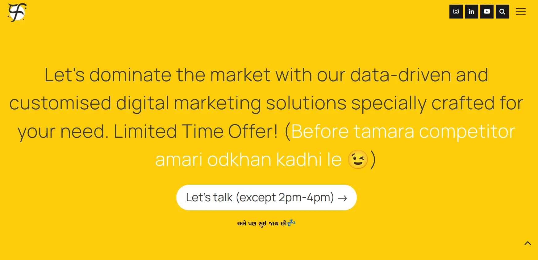
Click to read the blog and get a list of CTAs.
I just gave you a CTA to start reading the blog. The truth is, most people don’t intrinsically know what you want them to do on your website. You have to give them a little push, like a friendly, “Hey there, check out this amazing offer!” A well-written CTA can be a game-changer. It boosts user engagement and increases sales. Get ready—in this blog, we are going to dissect the world of CTAs and transform your digital space from a ghost town into a bustling marketplace.
Table of contents
- What is CTA?
- CTA (Call to Action) Helps You Increase CRO
- 5 Pre-Steps Before Writing CTAs
- CTAs To Increase Social Media Engagement
- CTAs To Generate Leads
- CTAs To Increase Sales
- Want Help In Creating Powerful CTAs?
- Frequently Asked Questions
What is CTA?
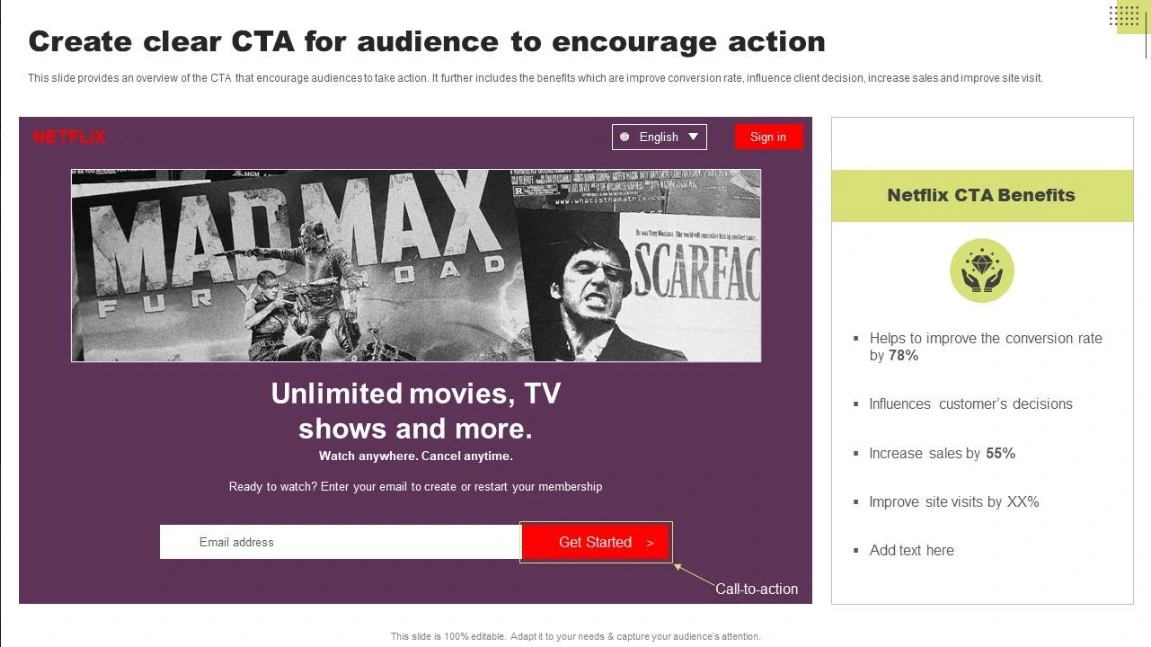
A CTA, or call to action, utilises your knowledge of marketing copywriting to craft headlines or copy that persuades users to take a specific action (the one you want). More formally, It is a website prompt that requests visitors to take a certain action, such as downloading a demo, purchasing a product, or subscribing to a newsletter is known as a call to action (CTA).
A call to action (CTA) is commonly found directly on the website, in a pop-up form, or a digital marketing advertisement. It can appear as a clickable button or hyperlinked text. When potential clients click on it, they move one step closer to converting.
A strong CTA can dramatically improve your user engagement and increase sales.
For example, you have written a great blog post about how to go viral with reels. The reader is interested and learning fascinating strategies to increase the chances of virality But then… what? They reach the end, maybe admire that adorable kitten picture on the blog cover image and then they are gone.
But with a compelling CTA like “Download our FREE eBook, you give them a clear next step. It increases the chances they will stick around and engage further with your brand.
CTA (Call to Action) Helps You Increase CRO
It might sound like a fancy term or a jargon word but it is quite straightforward. CRO (conversion rate optimisation) means to increase the number of people who complete a specific action on your website. It focuses on turning visitors into customers.
How is the conversation rate calculated?
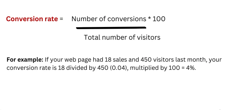
So, is there any good conversion rate? Not really. One cannot compare yourself to any real, ultimate industry figure with complete confidence. Instead, one should concentrate on getting a thorough grasp of what users genuinely care about so that you can meet their needs. Conversions will then come easily.
One of the ways to increase your CRO is:
- Make strategic use of CTAs
- Do trial and error and see which CTAs work best for your websites
5 Pre-Steps Before Writing CTAs
Before you start writing a list of CTAs.. take a step back. Here are a few things to consider:
Step 1: Track & Analyse
Find out more about your website users’ preferences. You should use this data to determine the most effective areas to focus your conversion optimisation efforts. Some of the data points that can be tracked are:
- Data on traffic & traffic sources
- Data on user behaviour on the landing page
- Bounce & abandonment rates for forms.
Once you have all this data, the next best thing to do is.
Step 2: Know who’s your audience
Create a customer persona. Make a picture of your ideal user, known as a customer/user persona. This needs to draw attention to every important detail about your target users and prospects, such as their goals, dislikes, interests and pain areas. Your ideal user persona along with quantifiable data can assist you in better understanding what works and what doesn’t on your website.
Step 3: Define & highlight USP
A USP is an easy explanation of why a customer should choose your products or services above those of your competitors.
The USP should highlight your best quality and should be communicated through headlines, graphics and copy.
According to marketing experiments, your USP should be summed up in no more than 10 words.
Step 4: Remove all distractions from your website
Look at visitors’ behaviour data to determine what aspects of content appeal to and don’t appeal to the target audiences. This way one can clear distractions or clutter on the website.
Start with an image. According to an A/B study published by EcoConsultancy. Expanding graphics to a size 28% larger than their original resulted in 63% more clicks and a 329% increase in customers completing online forms.
Step 5: Use different types of CTAs
- Text-based in-line CTAs: CTAs that are written directly within the content of the blog. For example, This is a text-based-in-line CTA from a blog on the website CTAs examples

- Sidebar CTAs: These types of CTAs are clickable and can help you link to an important page of the website.
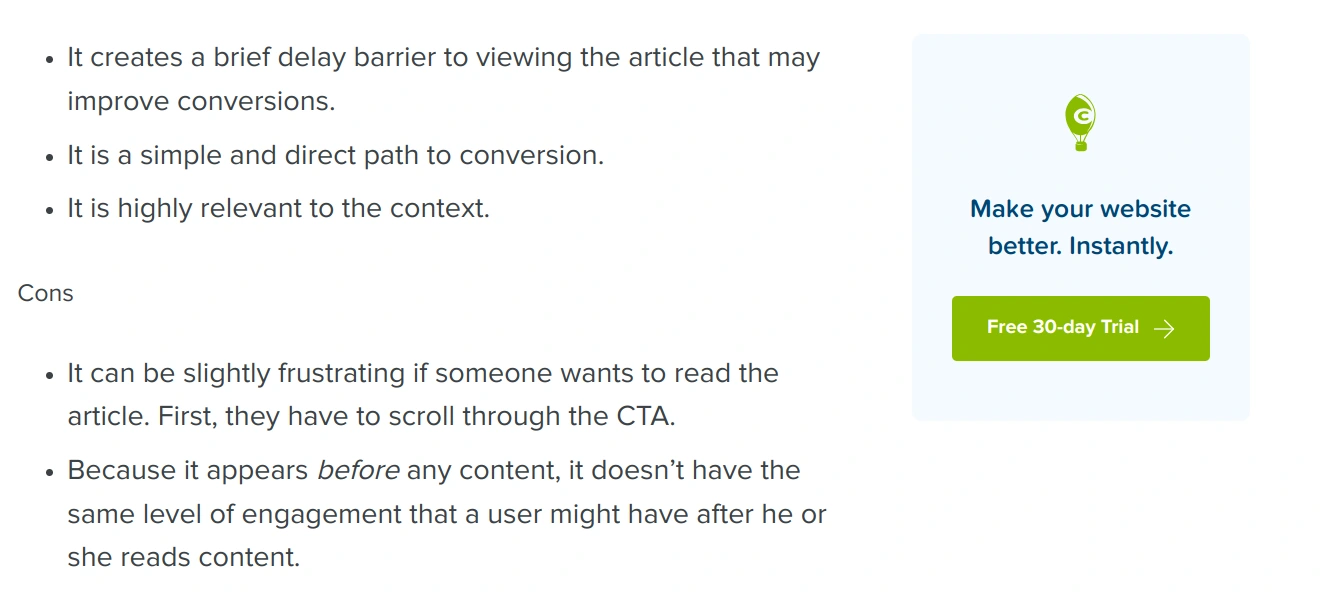
- End-of-post CTAs: End-of-post CTAs: Tthese CTAs are at the end of your blog post. They lead your readers to take action after they finish reading your blog
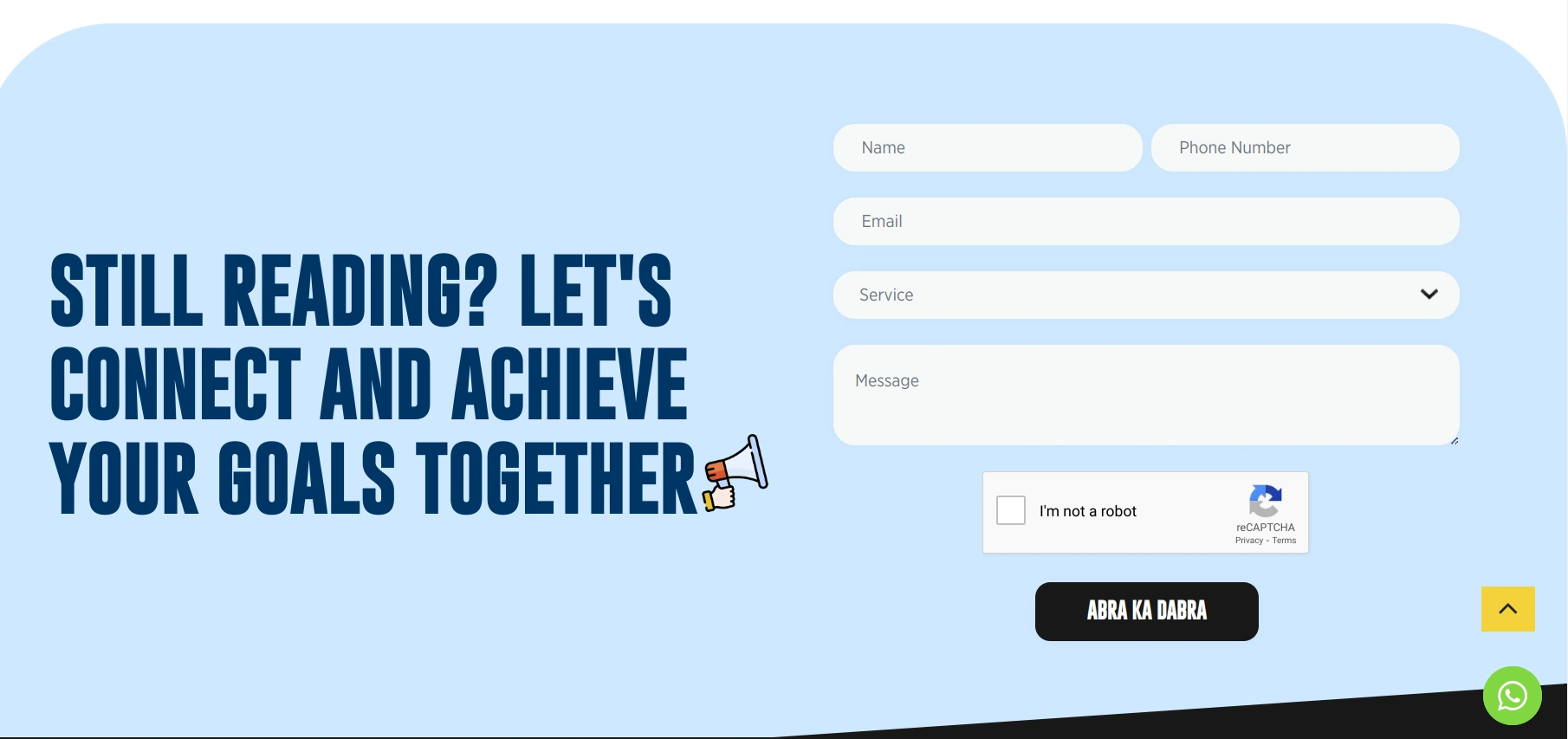
- Slide-in CTAs: This is a simpler method of encouraging visitors to convert on your blog posts than a “click here now” CTA.”You frequently won’t be able to read a blog post before completing the form or clicking on the latter kinds of pop-up CTAs. That kind of CTA is not a very pleasant experience. You may provide your readers with more information while still enabling them to read the blog post by using the slide-in call to action.
CTAs To Increase Social Media Engagement
CTAs are not just for website conversions, they also help to increase social media engagement. social media is a crowded space. You can make your posts stand out with CTAs that encourage interaction. Here are some ideas:
Ask questions
Spark conversation with a thought-provoking question related to your post. For example, if you are a travel blogger, you could ask “What’s your dream vacation destination?” or “Beach lover or mountain explorer? Tell us in the comments!”
This not only increases engagement but also helps you understand your audience’s interests.
Run contests or giveaways
Who does not love a good giveaway? Incentivise engagement with a chance to win a prize related to your brand. For example: “The comment with 0 likes will get a free supply of our snacks for a year”. A social media marketing company can help you run strategic contests and giveaways,
Use emojis strategically
A well-placed emoji can add a touch of personality and grab attention in a crowded social media feed. But don’t go overboard! A single emoji strategically placed can be effective, while a string of them can appear unprofessional.
CTAs To Generate Leads
Lead-generation CTAs are like magnets for potential customers. Here is how to craft them for maximum impact:
Highlight the benefit
Don’t just say “Sign Up!”. Explain what users will gain by subscribing, like exclusive discounts, expert tips or early access to new products. For instance, a fitness brand could use a CTA like “Download Our Free 7-Day Workout Plan and Get Started on Your Fitness Journey Today!” This communicates the value proposition and persuades users to take action.
Create a sense of urgency
“Limited spots available!” or “Download before it’s gone!” can nudge users to take action before they miss out on a valuable offer. Scarcity marketing can be a powerful tool but use it sparingly to avoid appearing pushy.
Use strong verbs
“Get Your Free Guide Today!” or “Unlock Exclusive Content Now!” to pack a punch and encourage clicks. Strong verbs like “get,” “download,” and “unlock” give users a clear idea of the action you want them to take.
CTAs To Increase Sales
Ready to watch those sales figures climb? Here are some CTA tips to convert website visitors into paying customers:
Focus on the X factor
What makes your product or service unique? Highlight that special something in your CTA. For example, a company selling handmade jewellery could use a CTA like “Shop Now and Experience the difference of artisan craftsmanship!” This emphasises the unique value proposition and sets your brand apart from the competition.
Offer a clear incentive
Discounts, free shipping or bonus products can all be powerful motivators. Consider your target audience and what kind of incentive would be most appealing to them. A clothing store could use a CTA like “Add to cart and Get 15% off your first order!” This provides a clear incentive and encourages the user to complete the purchase.
Create a sense of urgency
Limited-time offers can create a sense of urgency and encourage users to buy before the offer expires. This doesn’t have to be deceptive, but a CTA like “This Offer Ends Midnight Tonight! Shop Now!” can nudge users to make a decision.
Want Help In Creating Powerful CTAs?
Crafting effective CTAs is an art. Here are some resources to help you on your journey:
A/B testing
This allows you to test different variations of your CTAs to see which ones perform best. By testing different colours, wording and placements, you can continuously refine your CTAs for maximum impact.
Digital marketing companies
A digital marketing company can provide valuable expertise in crafting compelling CTAs that align with your overall marketing strategy. They can also help you with other aspects of your digital marketing efforts, like marketing automation and social media marketing.
Remember, a well-written CTA doesn’t have to be complicated. Keep it clear, concise and focused on the user’s benefit. With a little creativity and these handy tips, you can transform your CTAs that convert leads into customers


