
Ever found yourself strolling into a store with a clear mission to get a particular item, only to have your attention captivated by a neon pink display, and suddenly that’s in your shopping bag? Colours have that effect! They can subtly make promises of excitement, trust or even luxury. Today, let’s unearth the layers of colour psychology and explore how brands skillfully use colours to cast their spell on us.
Table of contents
- What is Colour Psychology?
- Why do Colours Matter in Branding & Marketing?
- Crafting Your Brand’s Identity: A 5-Step Colour Guide
- Top 5 Brands Who Use Colour Psychology in Branding
- Wait! Are Colours Beyond Branding & Marketing?
- In Conclusion
- Frequently Asked Questions
What is Colour Psychology?
Colour psychology is the study of how different colours influence people’s emotions and behaviours. It looks into how colours can influence emotional reactions and how various factors like cultural background and age can impact people’s reactions to colour.
Colours were frequently employed in ancient cultures to affect emotions and treat various ailments. They contributed to several spiritual disciplines as well.
In 1666, the English scientist Sir Issac Newton discovered that pure white light splits into all of the visible colours when it goes through a prism. Additionally, Newton discovered that all colours are composed of a single wavelength and cannot be further divided into multiple colours.
Additional tests revealed that other colours may be created by combining light. For instance, orange is produced when red and yellow light are combined. When some colours, like green and magenta, are combined, they cancel each other out and produce white light.
So how colour psychology is used in branding and marketing. The immediate next section answers that:
Why do Colours Matter in Branding & Marketing?
Colours set the mood for a brand and shape the overall experience. They serve as the foundation of everything, from your brand’s logo to social media creatives, company annual reports and business cards. Eventually, there comes a point where people instantly recognise a brand just by its colour.
Surprisingly, 93% of consumers base their purchasing decisions solely on visuals. Colours have the remarkable ability to brand awareness and recognition by 80%. Next time you go to a supermarket, observe just the colours of the packaging.
You will notice a pattern – healthy and environmentally sustainable products often sport green packaging, while food items or packets lean towards red. The adorable diaries, pouches and stationery items? You will find them predominantly in pink and purple. Apart from this:
Colour helps your brand differentiate from competitors
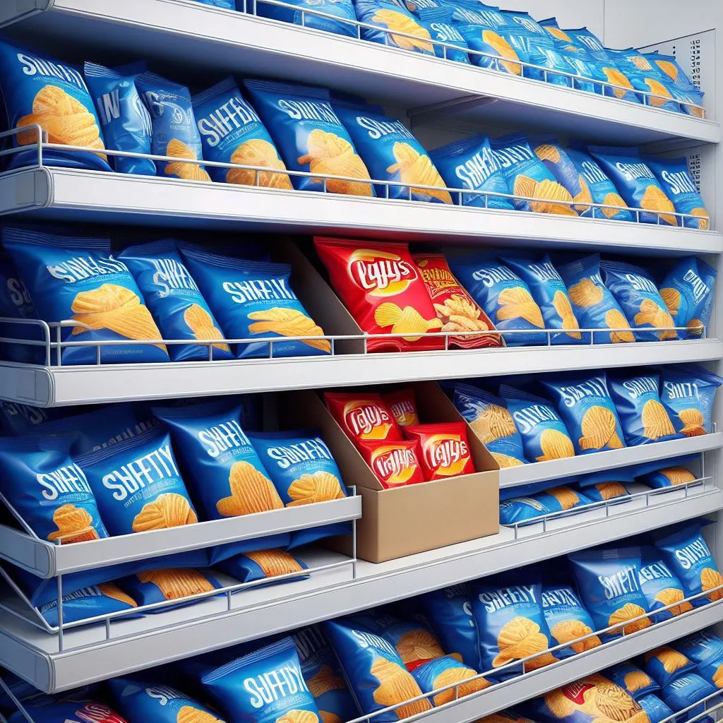
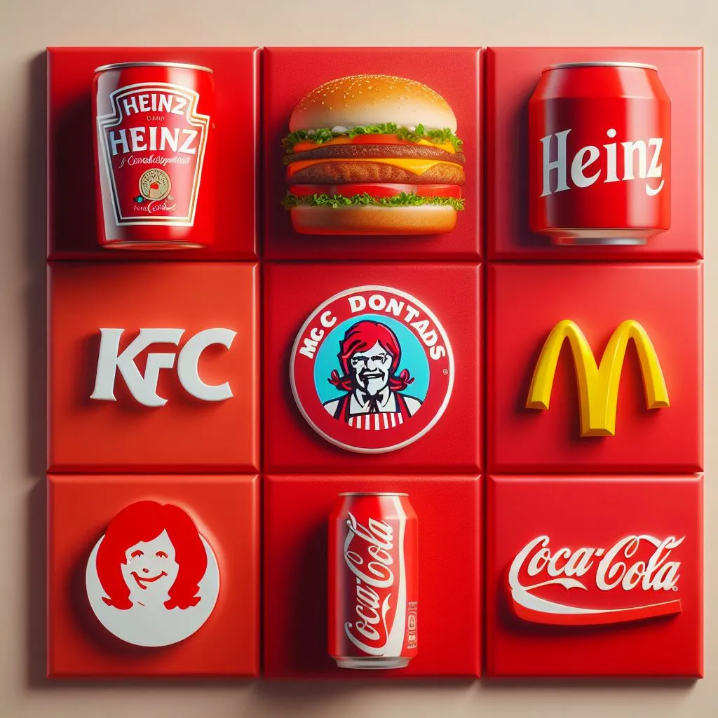
I am sure the red snack packet caught your eye amongst so many blue colour packets. That’s why colour psychology in branding is important. Choosing a distinctive colour palette ensures that amidst a sea of competitors, your brand catches the eye. It’s not just about being seen; it’s about being remembered. Think of the iconic red of Coca-Cola or the soothing blue of Facebook – these colors aren’t just colours they are statements that make brands unforgettable
It aligns with what you are selling
Have you ever noticed how different colours evoke certain feelings? If you see a deep purple wall in someone’s house, it gives off a royal vibe. If you spot a lively red colour on a restaurant menu, you suddenly feel hungrier. Hmm… it makes sense now. That’s why Doritos and Pringles have red packaging. It’s not just a random choice; they are associating their products with values and emotions connected to that colour. Choosing colours that resonate with what you offer builds a harmonious bridge between your brand and your audience.
Colour decides everything for your marketing stuff
From social media posts to brochures and website banners, the colour you choose is the silent storyteller of your brand. It’s the unsung hero that sets the tone, conveys your message and elicits emotions. Bright, vibrant colours might scream energy and excitement, while muted tones offer sophistication and calm. So choose your colours wisely and let your brand’s true colours shine!
Crafting Your Brand’s Identity: A 5-Step Colour Guide
Follow our 5-step colour guide to craft your brand identity through colour psychology
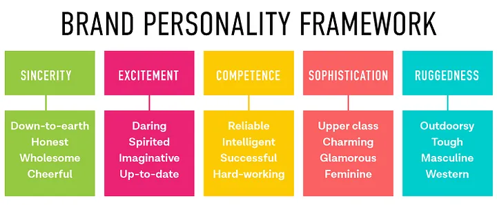
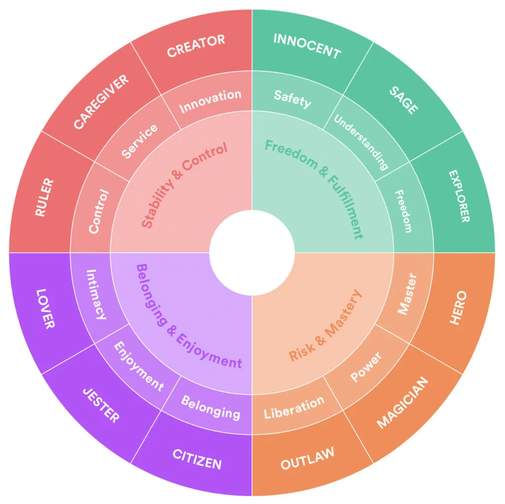
Choose a brand personality
Brand personality involves attributing human characteristics to a brand name. Companies must define their brand personalities accurately to connect with the right consumers. Aim for a positive emotional response from your target audience. Make sure to distinguish brand personality from imagery, such as creative assets. There are five main brand personalities, each with distinct traits. Specify your target brand archetype and align it with your intended audience for a strong brand identity. There are 12 brand archetypes to choose from.
Choose a colour for that personality

Some examples of colour emotions are:
- There are three primary colours red, yellow and blue. All other colours are formed from these colours and are called secondary colours.
- Aggression and passion are linked to the colour red. Red conveys a feeling of urgency. This is why this colour is frequently used in promotions and clearance sales. Additionally, it increases hunger, which is ideal for restaurants that serve fast food. Red is also connected to speed and excitement.
- People associate the colour blue with sky and water, which are linked to serenity and reliability. So blue is often used by brands to encourage consumers to trust their products.
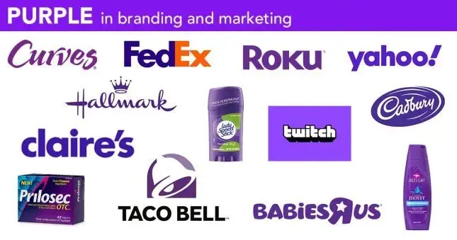
- The secondary colours are green, purple and orange. One of the rarest colours found is purple. Because of this, it is seen as a royal colour and is connected to originality. It inspires creativity and conveys luxury, judgment and respect. Purple is frequently used by the cosmetics industry to advertise beauty and anti-ageing products.
Create a colour palette
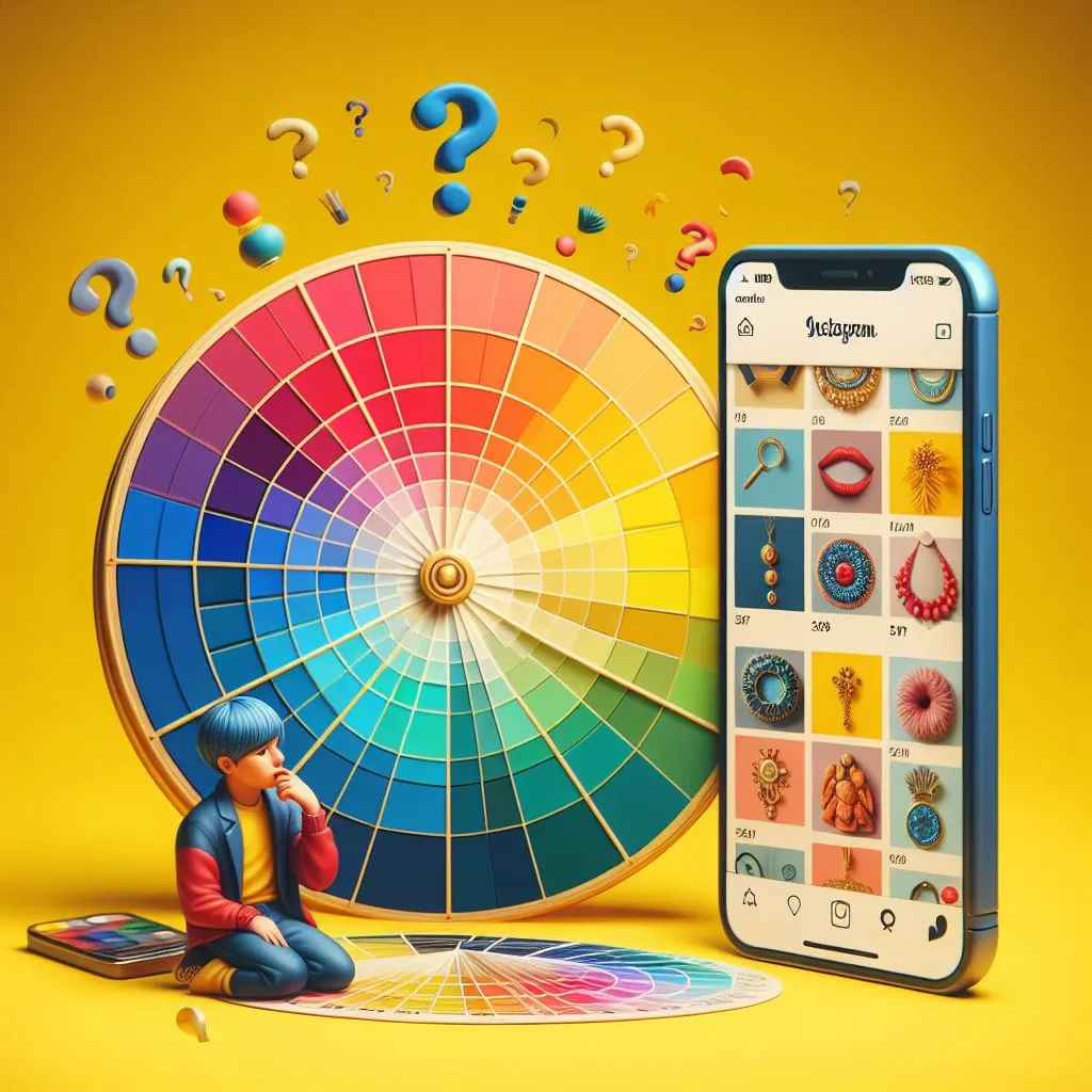
Colours aren’t just “pink”; there are various shades like hot pink, rose pink, baby pink, and salmon pink. Once you have picked a colour, go ahead and create a palette that includes its related shades for your future creatives. This colour palette isn’t just a pretty picture; it becomes the guide for a digital marketing agency you work with. It guides the ideation and design of your posts, ensuring they align perfectly with your brand’s tone and values. After all, it’s not just about choosing a colour; it’s about creating a language that speaks your brand.
Pro tip: Consider using the Pantone Color of the Year for added creativity. For 2024, it’s “Fuzzy Peach.”Read our blog and see how you can creatively use this colour.
Follow the colour palette across all communication channels
Consistently use your chosen colour palette in designing Instagram, Twitter and Facebook creatives. Extend this palette to your business communication, business cards, pamphlets and all other communication channels for a cohesive brand image.
Top 5 Brands Who Use Colour Psychology in Branding
Nickelodeon – Orange
Launched in 1979, Nickelodeon was the first children’s cable channel. Since 1984, Nickelodeon has continuously incorporated orange throughout its marketing and branding, focusing on the creativity and youth this colour implies.
While adults find orange to be suitable, comforting and safe, youngsters associate the colour with playfulness, excitement and entertainment. A brand such as Nickelodeon is only as successful as its ability to persuade parents and kids alike that the content they provide is worthwhile.
Uber – White
Uber’s use of white in its logo is based on the colour psychology of the belief that white is a colour of simplicity, elegance and purity. In addition, white can convey neutrality, spaciousness and contrast. Uber’s logo makes use of white to design a sleek, contemporary style that goes with its unique typeface. “Uber Move”. In stark contrast to the black backdrop are the vibrant designs, which stand for various markets and services.
Hershey’s – Brown
Brown is a natural colour and it’s associated with all things organic. Food is one way that brown has come to be associated with particular things. Some folks find comfort in chocolate. Light, nutty smells are considered to give recipes strength and balance. Hershey is a chocolate producer, so it should come as no surprise that they chose this cosy colour. It speaks to the company’s long history and steady position as a leader in the sector.
Taaza Tea by Brooke Bond – Green
Since green is a colour associated with nature, it suggests natural, fresh, or organic products. Thus, like Taaza, brands of tea that emphasise freshness are usually branded green as opposed to powerful dust teas, which are branded red.
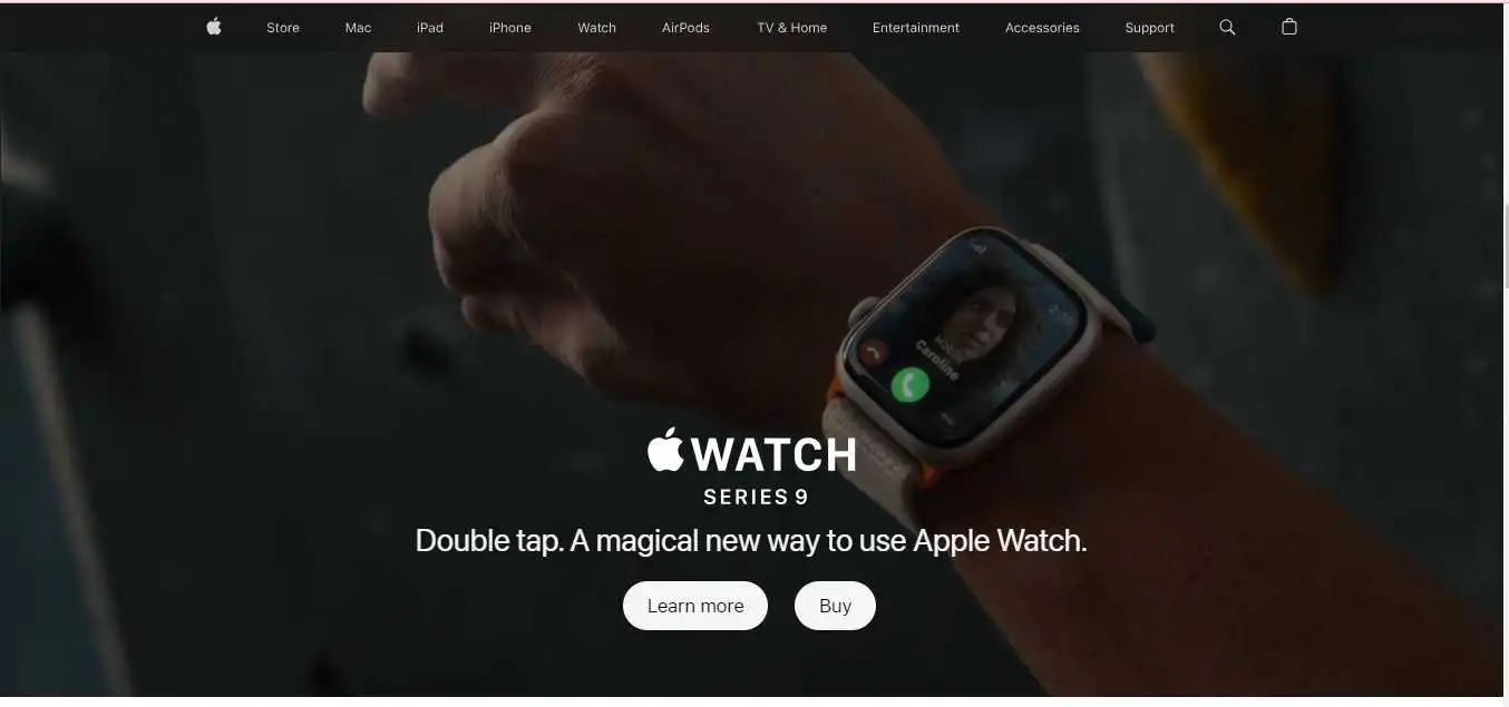
Apple – Grey colour
Grey is the colour of balance and neutrality in colour psychology. Its significance as a colour most likely comes from its having a tint between black and white. However, Grey does have some negative associations, especially about loss and depression. To appeal to a wide audience, grey can be utilised for font colour, headers, images and even items.
One company that incorporates the colour grey into its branding is Apple. Ultimately, a lot of their computers are silver or grey in colour since it’s a neutral colour that doesn’t turn people away. To set its white logo against a grey header, the website uses this colour scheme. Nonetheless, a harmony between white, black, and other colours can be seen throughout their branding.
Wait! Are Colours Beyond Branding & Marketing?
Colour psychology isn’t confined to just marketing; it permeates every aspect of our lives. From packaging to cinema, books, art and design, its influence is truly present everywhere. Take a peek at this fascinating Instagram page, (colorpalette.cinema) where they unravel colour palettes from scenes in various movies. The examples below showcase the enchanting interplay of colours in different settings:
Exploring these reels not only offers a visual treat but also sheds light on how colours contribute to mood and storytelling in different forms of art and entertainment.Colours are related to the physical properties of light, such as wavelength frequency, and intensity. They can also be used to measure and display various phenomena, such as temperature, pressure, chemical reactions, etc. Colours can also be manipulated and enhanced by various technologies, such as filters, lenses, screens, printers, etc
In conclusion
Whether it’s the serene white of Dove or the sleek white of Uber, the world of colour psychology in marketing and branding shapes perceptions and creates unforgettable brand experiences. Ready to infuse your brand with the perfect colours? Let our digital marketing company sprinkle some magic on your brand’s palette. Contact us today at hello@florafountain.com and let’s paint success together!
Frequently Asked Questions

The founder and partner of Flora Fountain, Shefali leads the Content and Technology divisions. A one-time engineer who started her career writing front-end code, she took a detour sometime during her 9 years in New York, studied journalism and started writing prose, poetry and sometimes jokes. She now has 15...